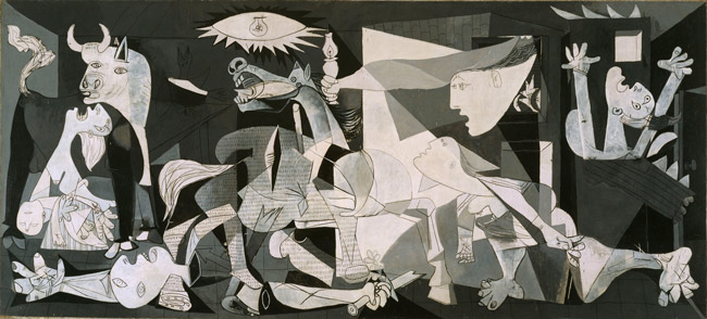
Pablo Picasso is well known for his unique and crazy paintings of twisted faces, lopsided eyes, fat cartoonish fingers, and psychotic bulls, but hardly anyone knows of his masterful use of the golden section. Today we take a look at one of his largest, most famous, and dramatic pieces he ever created…”Guernica.” We’ll see how Picasso applied dynamic symmetry to his painting to help organize his masterpiece.
There is a lot of drama going on in this scene with the mother on the left holding a dead child, a dismembered soldier on the ground with symbols of martyrdom etched into his palm, a horse with a gaping wound, the woman screaming in agony on the right, and the light fixture above creating a devilish eye. Picasso put a lot of thought into how he wanted to present this scene, and he didn’t fall short with his composition and use of the golden section.
Note: If you look close at the photo above you can see a bit of the frame around the edges. We need a good reproduction to get things absolutely precise, but in this case, we’ll have to use what we can find since we don’t have the original handy.
First, let’s just take a look at the size of his painting. It’s HUGE! Guernica is 11ft 5in high by 25ft 6in wide. When we convert those numbers into inches and do a little math we get something very interesting.
306in (length) divided by 137in (width) = 2.233
Now if we look at the ratio of the ROOT 5 rectangle we’ll see that it’s 2.236. Taadaa! We now know that Picasso used the root 5 to organize the elements within his composition because the ratios are the same.
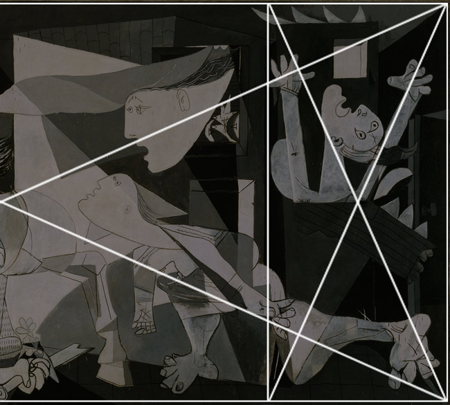
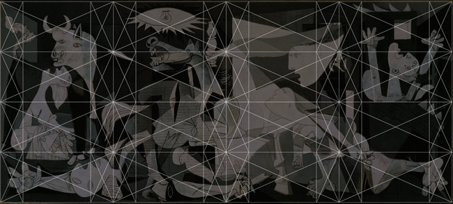
This is the left side of Picasso’s Guernica with the root 5 rectangle overlaid onto it (again, not exactly, perfectly precise because of our reproduction). You can see how the elements of his painting begin to parallel and lock into his grid. This is not a coincidence, Picasso planned this like any master draftsman would.
Here we have the right side where we see even more of his design locking into the root 5 grid. Just take a look at the arm of the woman on the right…there’s no denying his influence from the grid.
This is the full image with the root 5 overlaid onto it.
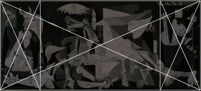
Now we can see 5 individual root 5’s within the mother.
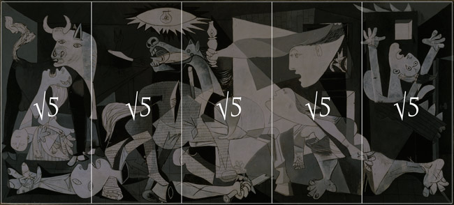
When we break the grid down further and place four root 5 grids within the mother we can see even more locking in. Picasso used this grid, this master tool, to help organize his composition and promote unity and repetition. His use of gamut is also profound and Myron explains gamut in depth within his DVD series.
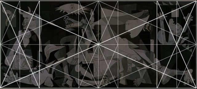
Since his painting is so large Picasso can break it down yet again to help him with the organization of elements within his design. Here we see 16 small root 5 grids within the mother root 5 rectangle.
Here are the areas locking directly into the armature of the root 5 grids. Not to mention all of the elements which parallel the diagonals within the grid.
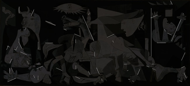
So you see, Picasso didn’t just try to shock people with his crazy imagery. No, he’s better than that. He presented his unique vision, employed design techniques, and used the golden section to create his masterpiece.
If you want to learn more about this amazingly dramatic painting here’s an excellent documentary which goes into detail about the history of Picasso’s masterpiece. Thanks for joining in today, see you next time!
If the link to the video is ever broken please search “The Power of Art Picasso” and you’ll find it on Youtube.

